Beefy.finance
Sole designer for the entire product – from research to dev review – on a product with 12,000 MAU and $584M TVL. A user deposits an asset into a vault, and the protocol reinvests the rewards automatically, with no manual farming.
- Role
- Senior Product Designer · end-to-end, sole designer on the product
- Team
- PM and two developers
- Domain
- DeFi/web3, yield optimizer
- Timeline
- February 2025 – August 2026
- Platform
- Web + mobile web

“The design system was good, very organized and instructions were clear. Compared to other designers I have worked with, it was better since we had a clear system.”
Eren
Beefy developer


Context
More than a thousand vaults, more than two dozen networks, and a peak user fund volume of $584M.
The entire product lives on a single screen. The home screen is a list of vaults, and almost all of the user's work happens here: they look for a place to put their money and decide whether the yield justifies the risk. Per internal analytics, searching for and evaluating vaults takes up 63% of user time – that's why we started with sorting and filtering.
That's what set the priorities: the work went where the user spends their time – the list, filters, search, and the vault card.
End-to-end product design
I was the sole product designer and ran the design end-to-end – from discovery and scoping to dev review. I worked directly with the product manager and two developers, with no design lead above me.
- Design system – built from scratch: 202 component families across 26 sections. The product had none before;
- Interface animation in Rive – button states during long blockchain transactions, micro-interactions, and elements for promo pages;
- Core product screens – vault list, filters and search, vault card, navigation, network and asset menus – mostly deep rework; Buy crypto, Bridge BIFI, dashboard and Treasury got targeted fixes – mostly padding – without a deep rework;
- New features – cross-chain ZAP and deposit transfer between vaults, beGEMS, Featured vaults, CLM merge – concentrated-liquidity pools, Safety Score card, wallet connector, message-signing page;
- Research – usability testing, interviews, competitive analysis; prototypes with variables and conditions, testing in Maze;
- Responsive design and UI polish – before me the product lived on three breakpoints; I got the interface to use all available space on any screen size and standardized spacing;
- AI in the workflow – since April 2026, agents for data gathering and deep research; Notion boards where a feature's structure comes together far faster; generating a set of component variants from a rough sketch or a brief, to find a workable direction and take it to the finish;
- Design handoff – onboarding the developer onto the task, handing off the mockup, dev review after implementation.
Typical task workflow:
- Research the layout, requirements, success criteria;
- Collect references;
- For large tasks – unmoderated UX tests on prototypes in Maze;
- Draw up use cases;
- Align with the product manager;
- Dev review.
A full product review was one of my first tasks: I went through every flow in Figma and logged every problem I noticed on a shared board – along the way, I started to understand how the ecosystem works: networks, platforms, vault types. The product manager went through the board with me: agreeing on some things, not on others, and the backlog took shape through that filter – the first tasks grew out of it.
Everything I did at Beefy over a year and a half
- Design system, from scratch
- Cross-chain ZAP
- Vault to Vault ZAP
- Sorting & filtering
- Value Proposition research
- Enhanced SearchIn dev
- CLM mergeIn dev
- Safety Score card
- Responsive / adaptive layout
- UI animation & micro-interactions
- Data visualization (price graphs)
- New wallet connectorIn dev
- Navigation menu
- RPC menu
- Asset menu
- beGEMS in nav
- Featured vaults 2.0
- Free ZAP campaign
- beGEMS – In-product campaigns & gamification elements
- Visual hierarchy – boosted vaults
- Heading visual hierarchy
- In-product branding – token visibility
- Tooltips upgrade
- Notifications
- Display “Suggested vaults” for the retired vaults
- Vaults page review
- Vaults page
- Vault page – scoped update
- Ultimate Vaults
- Main page
- Main page :: vault types
- Curator logos for the Platform
- Popup overlay
- Transaction “dust”
- MegaETH Points banner
- Wide lanes hiding
- Spacing system standardization
- MainPage padding fix
- Page title fix
- Withdrawal timer section
- Boost action in deposit flow
- Sorting: Current APY control
- Sign a message page
- Blogpost
Boosts
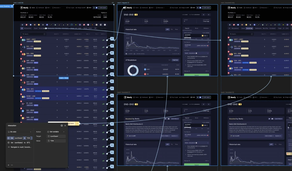
Boosts had just launched as an MVP, and the orange accent clashed with the palette. Not an isolated case: there was no consistent color logic across many elements. I built it out in parallel – gathering rules and feeding them into the design system's tokens.
At first there were one to three boosted vaults, simply pinned to the top of the list. Then five to ten, and after Profit Distribution shipped – twenty to thirty at once. The trick that boost visibility relied on stopped working: you can't pin thirty positions to the top.
Usability research
I initiated a field-testing program: I proposed the product manager set up a channel on the product's Discord server (about 10,000 members). That turned a one-off recruitment drive into a standing pool of testers who could be brought into new research without recruiting again. The product manager handled communication with participants; I was responsible for writing scenarios, running the tests, and analyzing results.
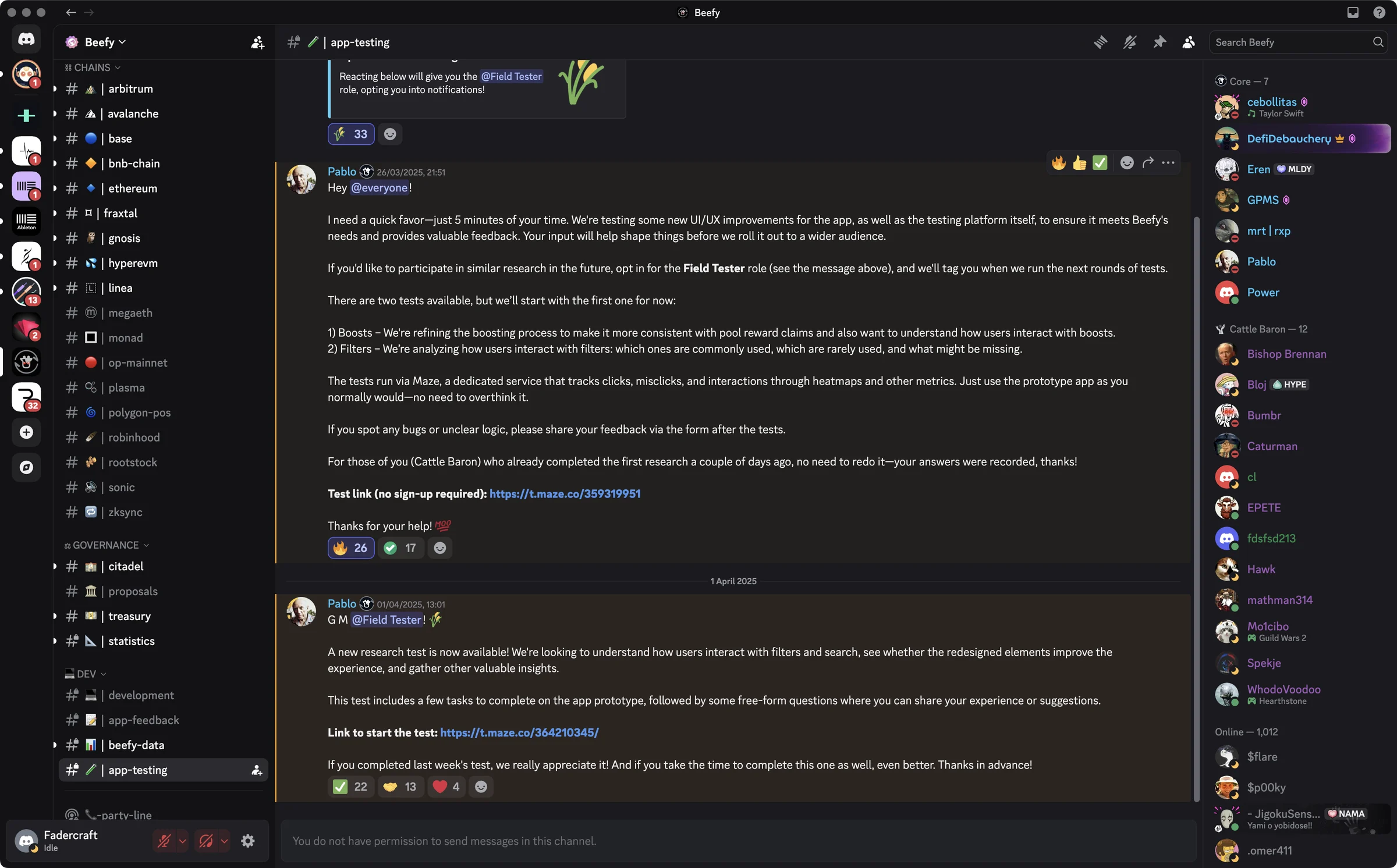
#app-testing channel keep working for every round of research after this oneUnmoderated usability testing
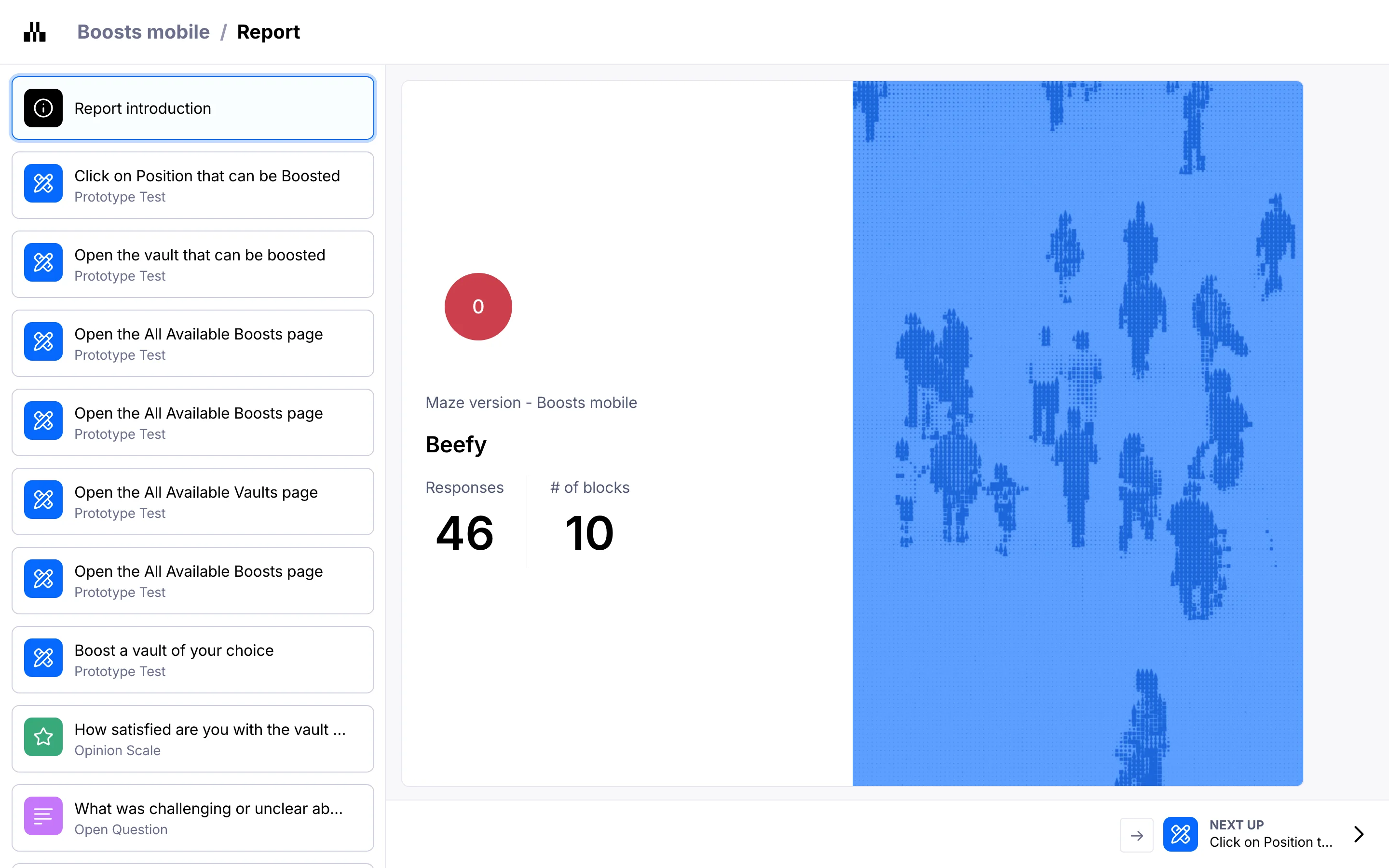
Participants completed tasks on their own time, with no observer or interviewer present. Tool: Maze – it logs every click and misclick, times each task, builds heatmaps, and collects open-ended answers. That gave a scale unmoderated research can't match: 98 user sessions instead of the usual five to eight.
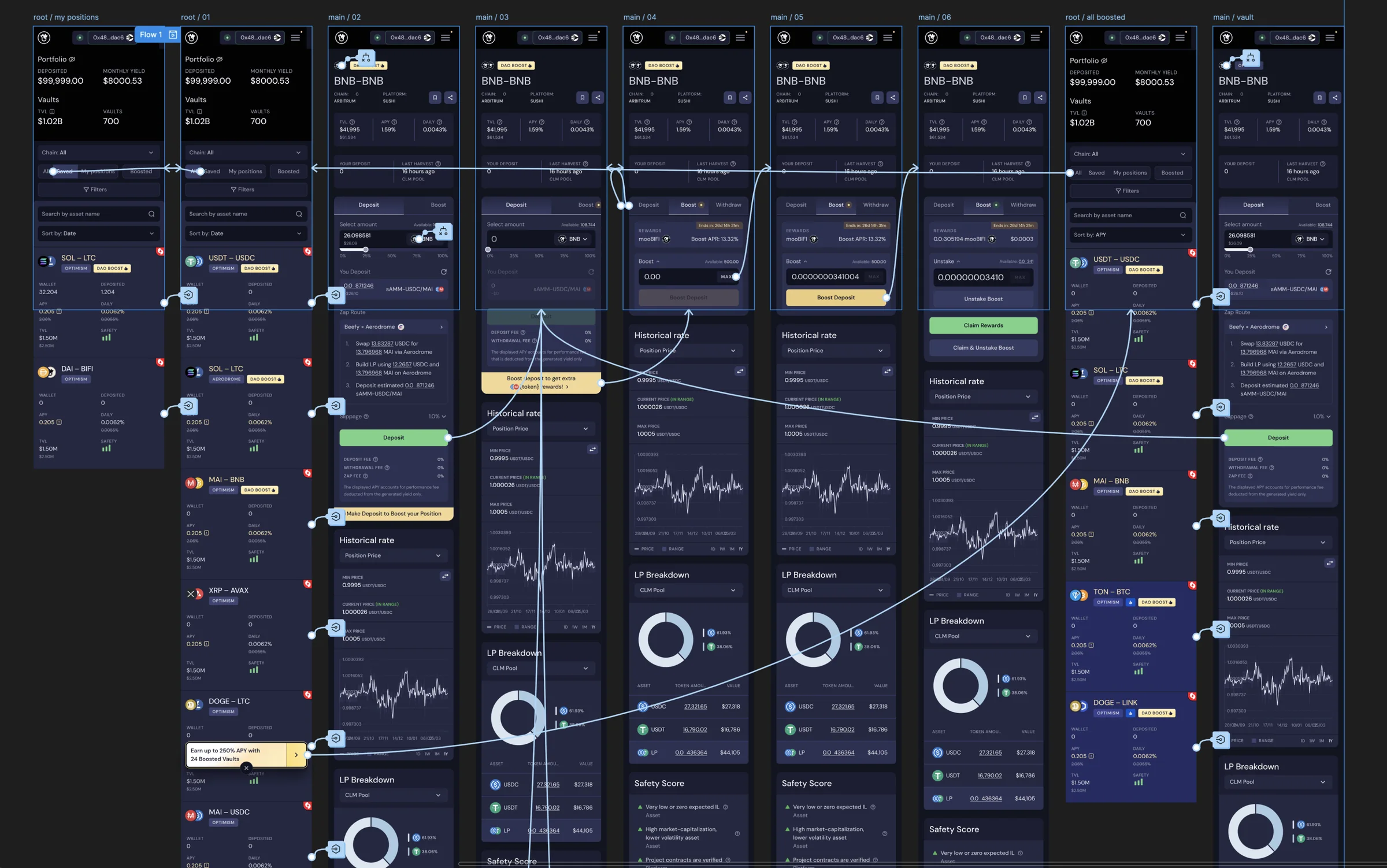
Boosts were tested in March 2025.


Results
46 participants.
As usual in Maze, not everyone makes it to the last task.
| Task | Success | Drop-off | Time |
|---|---|---|---|
| Open the vault that can be boosted | 46 of 46 | 0 (0%) | 12.1 s |
| Open the All Available Boosts page | 39 of 43 | 4 (9.3%) | 12.1 s |
| Boost a vault of your choice | 39 of 41 | 2 (4.9%) | 38.4 s |
On top of the quantitative data, I got qualitative feedback:
Boost satisfaction – 3.6 out of 5 (n=40). I made a methodology mistake here: the question "How satisfied are you with the vault boosting experience?" came right after three prototype tasks – both its wording and its position in the survey meant it could read as a question about the test just taken, not about the real boosting experience in production. Some respondents may have answered one way, some the other, and there's no way to say for certain which. The redesign itself deliberately addressed the complaints users listed.
Filters, sorting and search
Filters, sorting and search – the most heavily used part of the product. I took it on already knowing some of the problems: they were sitting on a board I'd started at a company-wide review and kept adding to throughout the work.
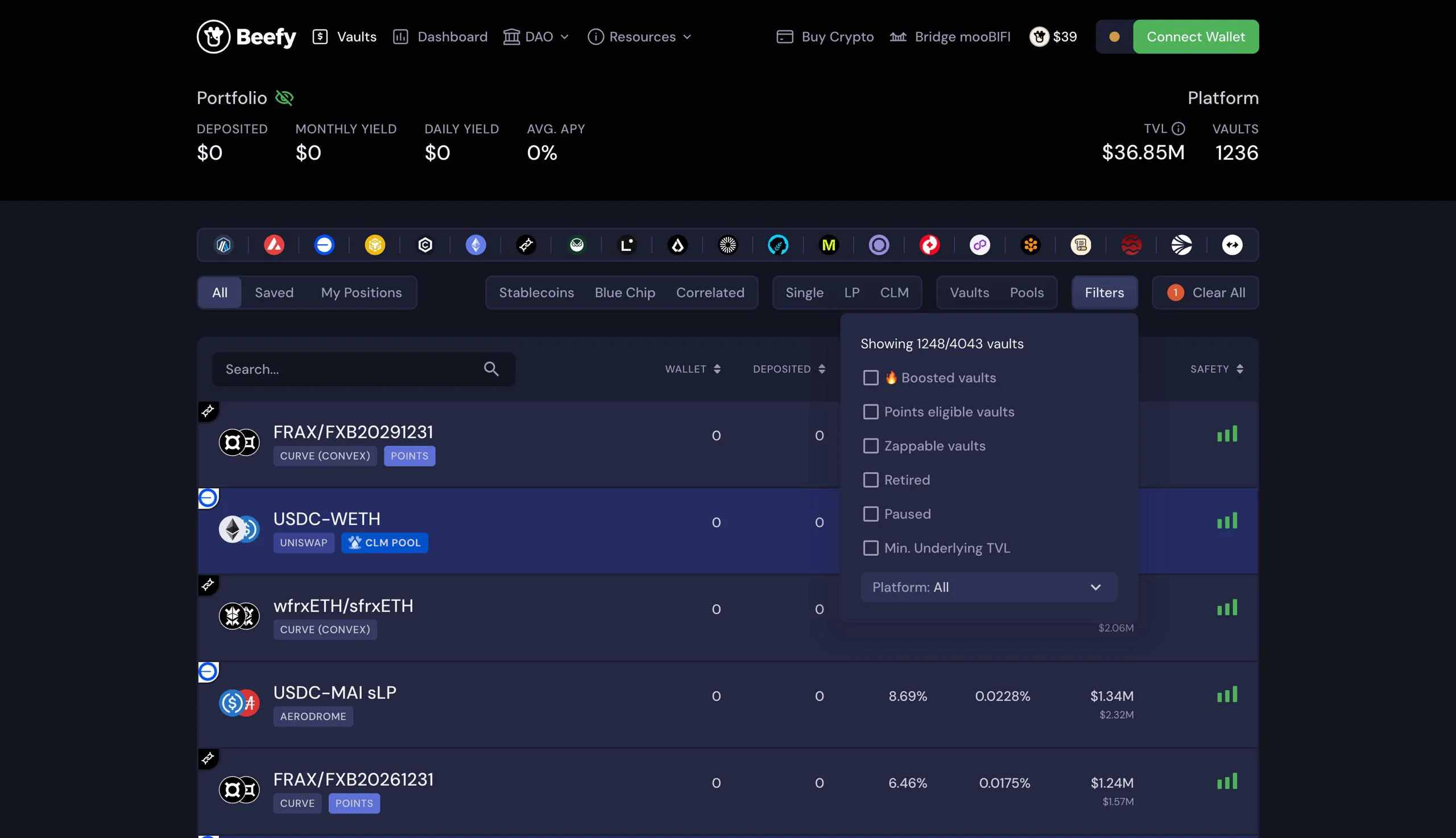


Sorting and filters sit above the list – on both desktop and mobile. They're the first thing to scroll out of view, so adjusting the results means scrolling all the way back up.
The controls are lined up in a row but don't read as one system. On desktop, groups of toggles are spaced too far apart, and search sits apart from them without saying what it searches by. On mobile, filtering and sorting are two components sitting side by side but not connected.
Boost, platforms, and the TVL threshold sit one level deep. Boosted vaults live inside the filter panel, the platform list sits at the very bottom of the same panel. "Minimum TVL" – the threshold on funds held in a vault – is built as a checkbox: its own control sits a level further in and only appears once it's turned on, so neither the value nor how to set it is visible before that.
Frequent actions take more steps than rare ones. First in line is the "All / Saved / My Positions" toggle – the one used least – while platform and minimum TVL are tucked inside an extra menu.
Usability research
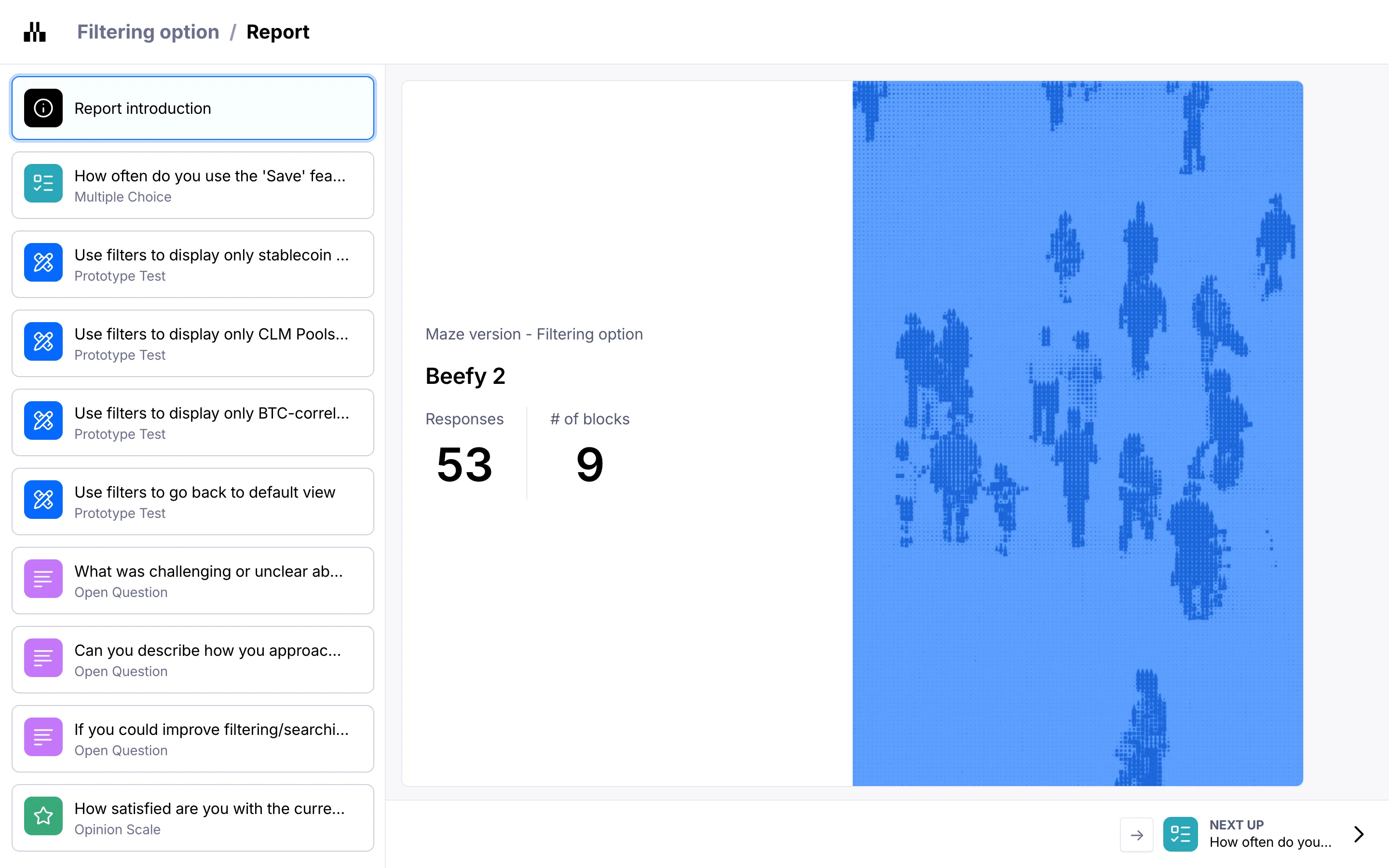
Boosts were tested in March 2025, filters and search in April – this time as a check on whether the reworked interface had gotten easier to understand.
Results
Filters, 52 participants.
Tested on the mobile prototype – desktop got the same solutions but wasn't checked separately with users, so the screenshots below are mobile.
| Task | Success | Drop-off | Time |
|---|---|---|---|
| Open stablecoin vaults only | 23 of 35 | 12 (34.3%) | 43.5 s |
| Open CLM pools with a boost | 19 of 29 | 10 (34.5%) | 26.2 s |
| Open BTC-correlated | 20 of 27 | 7 (25.9%) | 27.2 s |
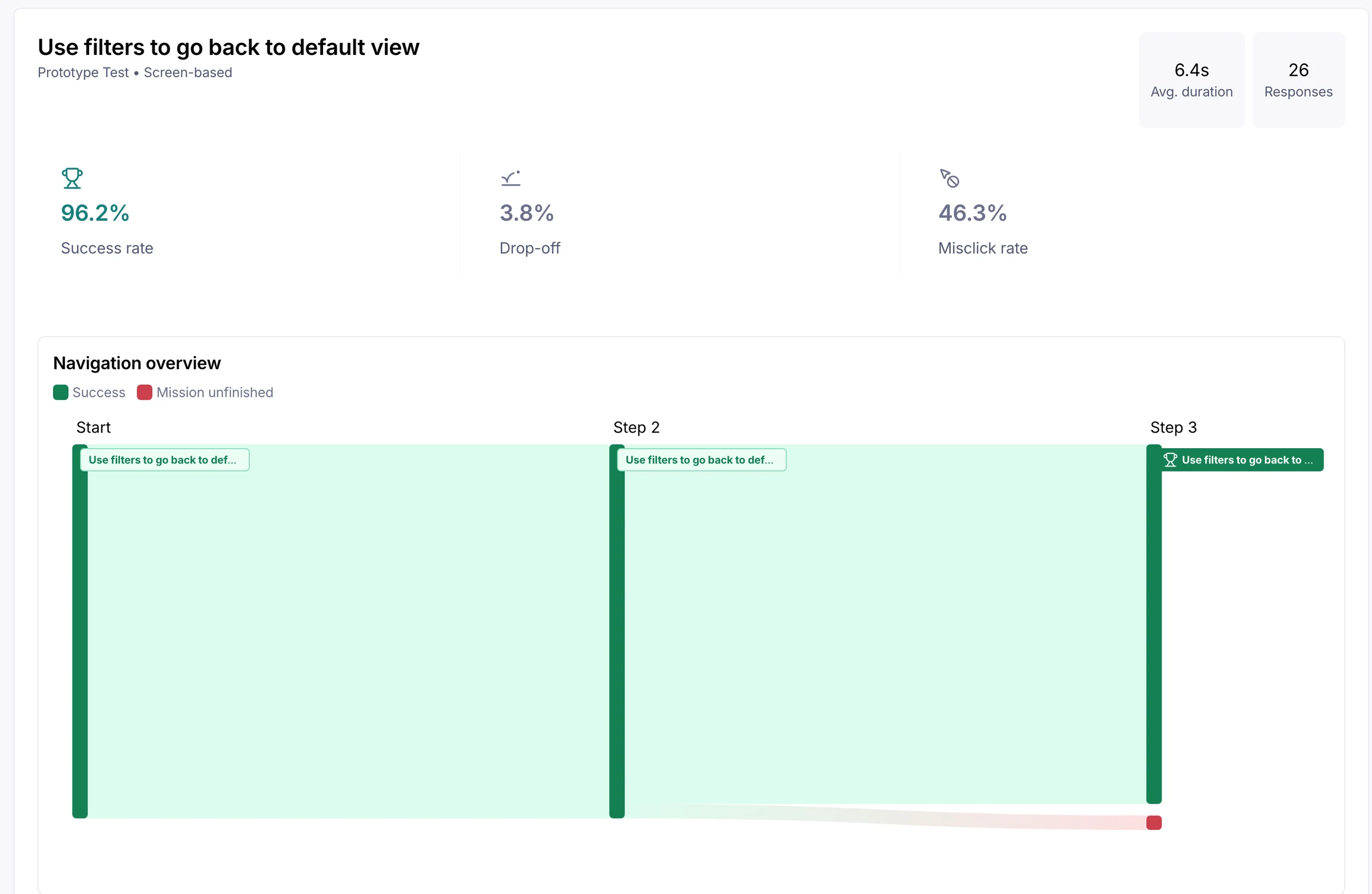
| Return to the default view | 25 of 26 | 1 (3.8%) | 6.4 s |
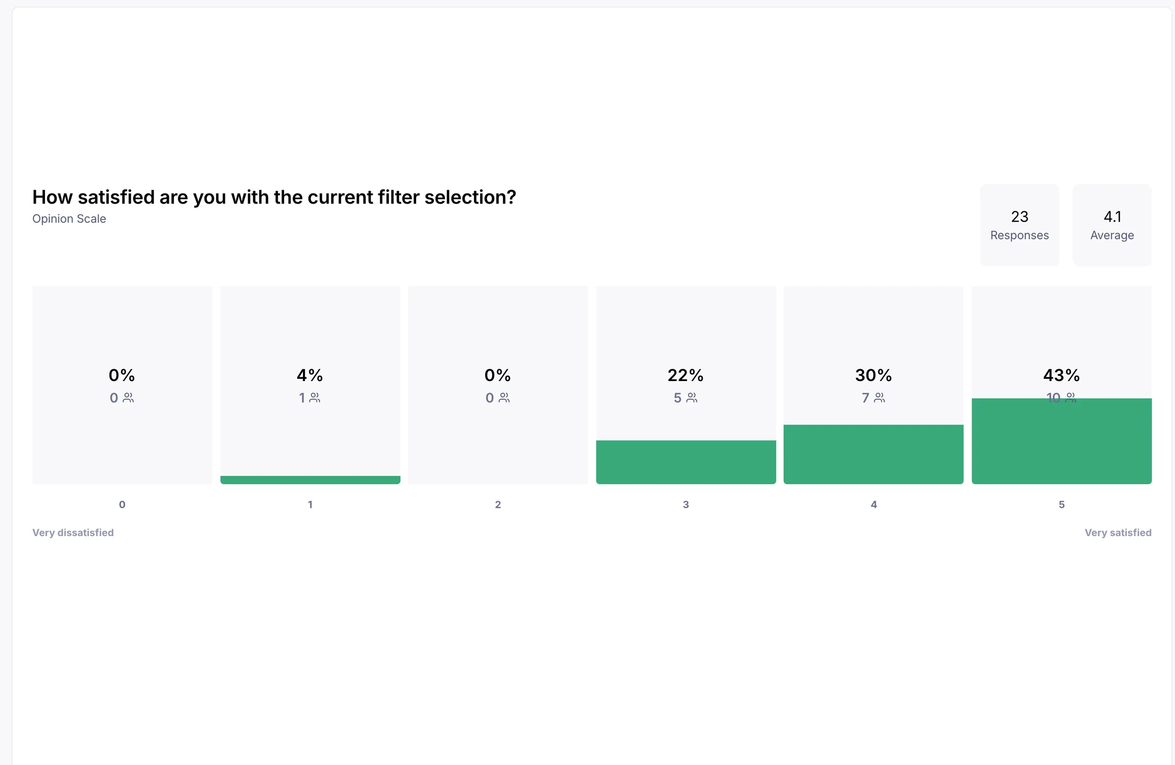
Participants who made it to the final question rated the experience they'd just had at 4.1 out of 5 (n=23 of 52 – the scale was shown at the end), higher than boosts (3.6/5).
There's no direct comparison with "before" – no baseline was taken, but users raised the same problems in Discord feedback.
The "All / Saved / My Positions" toggle used to sit first in line – the one used least – while platform and minimum TVL were tucked inside an extra menu. Frequent actions ended up taking more steps than rare ones.
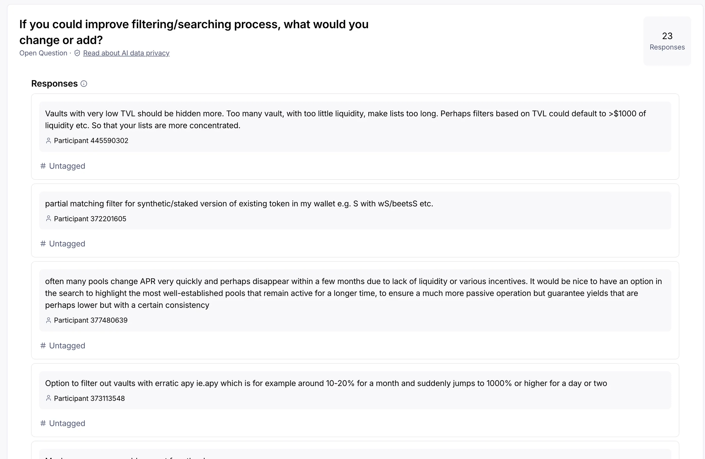
Part of that same feedback came up often enough to count by frequency – from the open-ended answers to both questions (n=26)
Design solutions and information architecture
Every decision answers a specific finding.
Boost is pinned in the visible area of the filter. It used to sit inside the dropdown panel with the rare parameters – now it's visible right away, with no need to open the panel.
Sorting got pinned – but only on desktop. I proposed a lighter option for both cases – not a permanent pin, but the panel appearing on scroll-up, on mobile and for filters on desktop – but the team chose to keep the permanent pin, since it already worked.
Controls are ordered the way people search. Network and asset category come first, vault type next, rare filters go deeper. The order in the interface matched the order in the user's head.


Added a Memes selector – the category was requested in open-ended answers on the filter test ("Meme vs regular alt coin selection").
Added responsiveness – the filter layout is built to fit the most controls on any screen size.


Cross-chain ZAP and the product model
Before this feature, moving between networks took 9 steps, and you could drop off at almost any one of them. And people rarely adapt to the protocol: they deposit what they already hold, and are often unwilling to bridge just for a trial deposit – if the vault is on Arbitrum and the money is on Ethereum, the person simply leaves.
Here's what it looked like, and what it became
| Original vault-to-vault deposit flow9 steps and 2 gas payments | Cross-chain ZAP6 steps and 1 gas payment |
|---|---|
| Choose the vault to deposit into | Choose the vault to deposit into |
| Figure out which network the vault is on, | Step is Gone |
| Figure out where their own asset actually is | Step is Gone |
| Move assets across a bridge, and pay gas | In the deposit tab, choose "From vault" |
| Find the target vault, | Choose one of their vaults from the list |
| Choose the network, | Step is Gone |
| Enter the amount | Enter the amount |
| Tap deposit | Tap deposit |
| Pay gas, and get the result | Pay gas, and get the result |
It only became clear along the way that the user shouldn't have to see the network barrier at all: to them it's just moving money into another vault. The interface adapted to the user, not the other way around.

Edge cases were worked through separately – situations where ZAP just isn't shown, and why:
| Condition | Why |
|---|---|
| Amount too small relative to the fee | Risk to the user outweighs the benefit – ZAP is hidden, not offered |
| Unsupported route | Technically impossible – ZAP is hidden |
| High slippage | Risk to the user outweighs the benefit – ZAP is hidden |
| Experimental vault | Risk to the user outweighs the benefit – ZAP is hidden |
| Partial failure state – part of the transaction went through, the other part didn't | There's no undo on-chain – we show status so users don't panic and retry, losing gas twice |
| Long wait on-chain | A write animation in Rive keeps the user in the moment, so the screen doesn't look frozen |
This feature is a good example of the full cycle end to end: research into the existing layout, a dedicated reference page, then use cases broken down by state – notifications, the waiting animation, and the edge case where everything has to show at once. And a dev review at the end. A dedicated page per state makes it clear what the feature does and why it exists. Not bureaucracy.
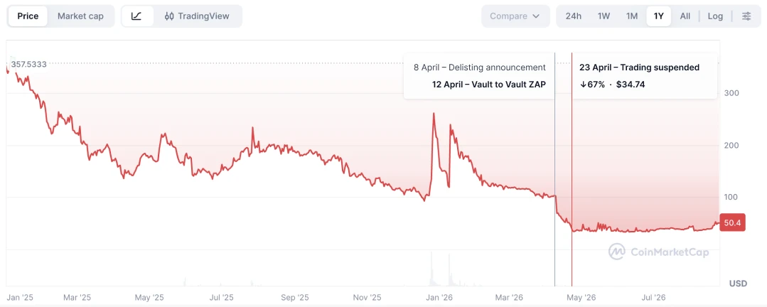
The same pattern came in handy again, under very different circumstances. On April 8, 2026, Binance announced BIFI's delisting, the project's token. The token lost a third of its value within a day. It wasn't just the price – trust went with it: it got more expensive for users to enter, exit, and move between vaults. Vault to Vault ZAP shipped on the fourth day after the announcement – the same transfer without an intermediate asset, applied to a crisis instead of everyday friction.